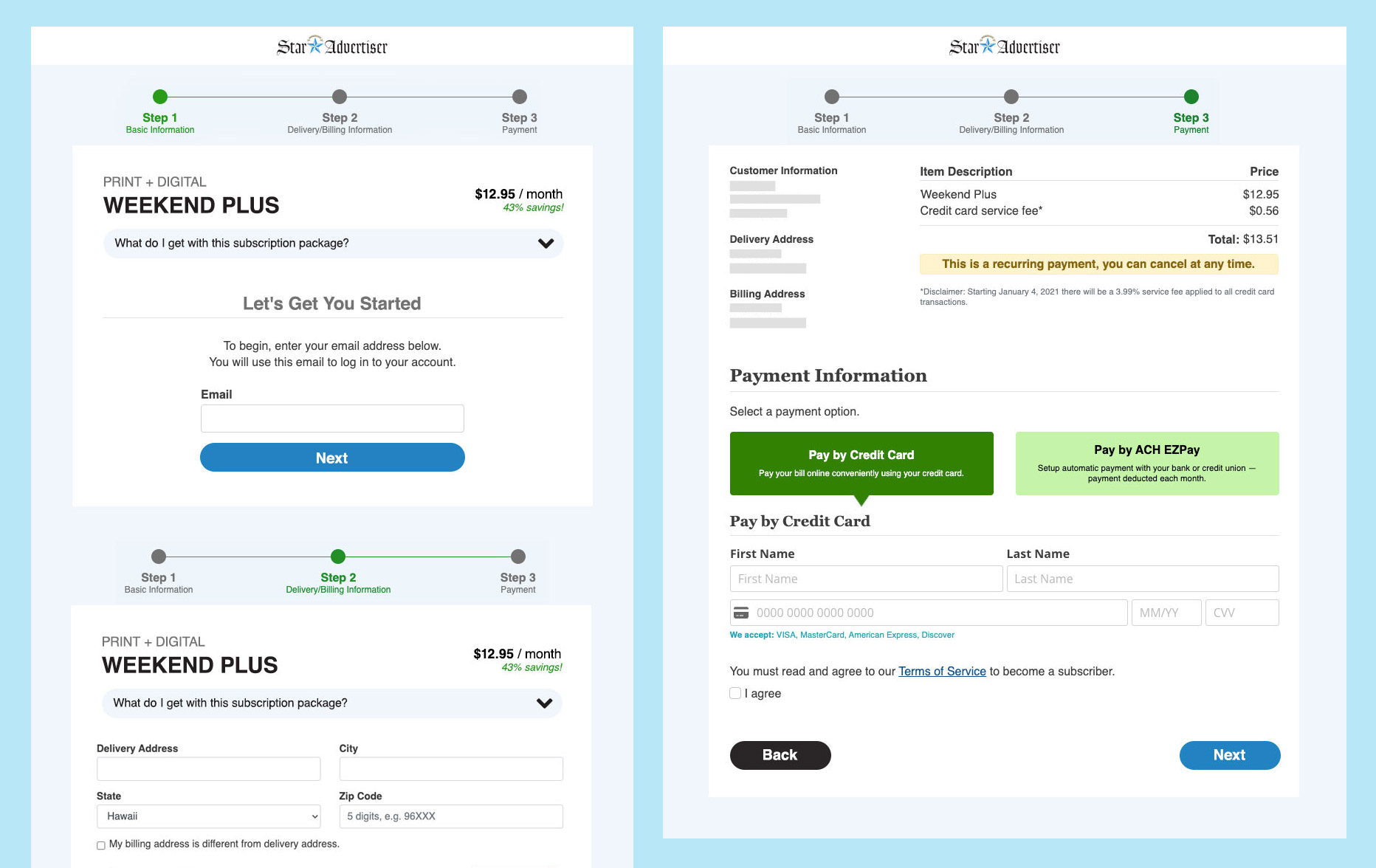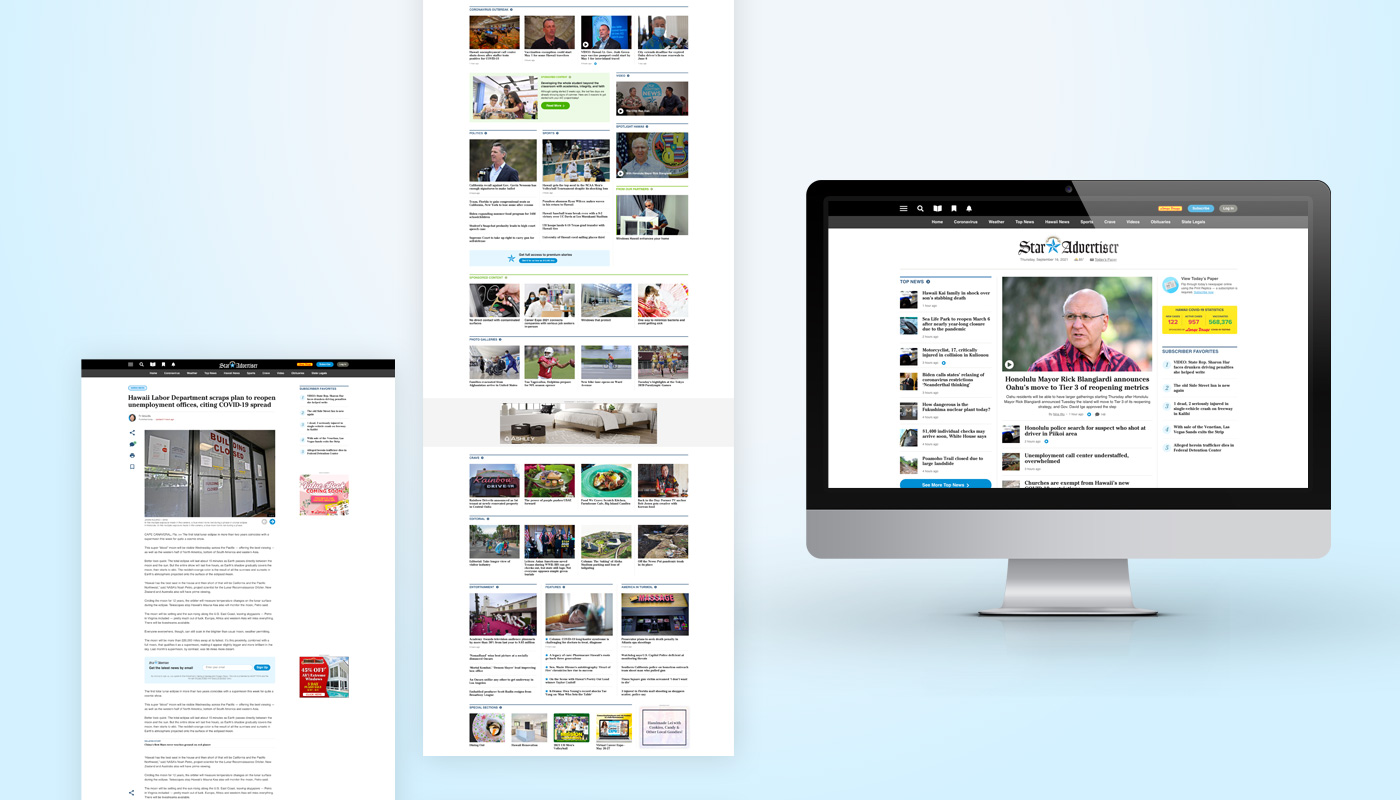

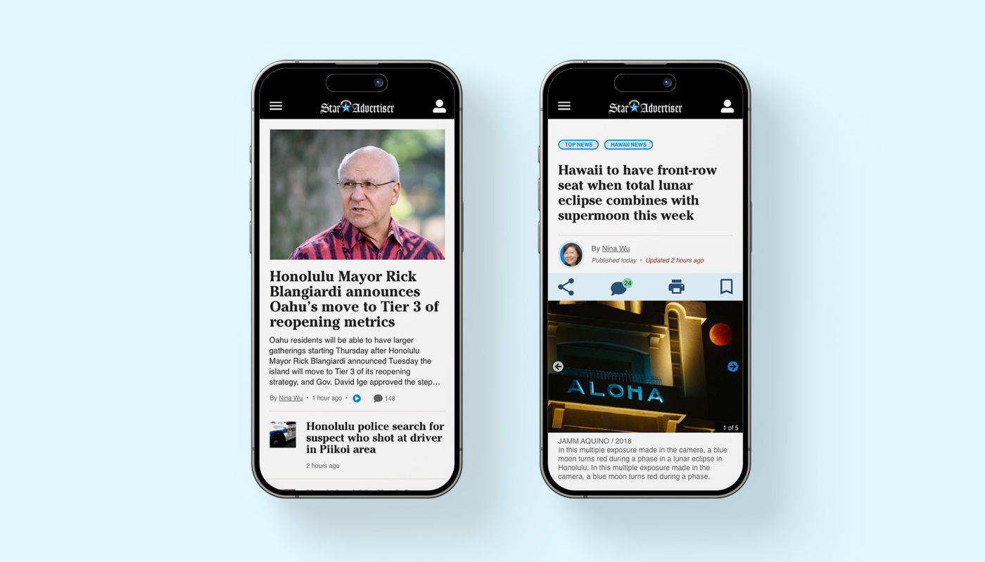
I was tasked to re-design the Honolulu Star-Advertiser website. With the large amount of newspaper sections, my goal was to make it easier and more intuitive for users to browse the news. To solve this challenge, I use a three-tiered navigation menu. The top navigation bar in black is meant to display account-related features such as login, subscription, bookmarks, and notifications. The gray navigation bar beneath that is a list of the most popular sections. On the top left is a hamburger menu icon that will pop up a comprehensive list of all sections and pages. A conscious effort was made to display large thumbnails for the larger headlines to encourage page views. Subtle leaf graphics are used here and there to incorporate a local Hawaiian feeling.
Project Goals:
- Improve user experience and allow readers to find news stories to read
- Increase page views and time on page through layout and headline placements
Tools Used:
- Adobe Photoshop
- Adobe XD
- Bootstrap
- HTML/CSS